Our Logo
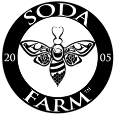
In the early years, people would ask us about how we came up with the name "Mockingbird Meadows" for our farm and our logo. When we changed our name to Soda Farm, we were careful to preserve this history as the design inside our bee.
Why the name Mockingbird Meadows?
When we first started beekeeping, mockingbirds built a nest in the tree above our first hive as if to watch over our endeavors and to protect the bees. Since that initial nest, they have stuck with us year after year bringing song and curiosity to the farm.
Who Created The Logo?
Carson created the original log for the farm as well as the current one. While he has never had any formal training in marketing- he clearly has some natural talent. We have depended on Carson's artistic direction to create ALL of our labels and marketing materials until 2023... when we brought on NW&Beyond Marketing.
The Mockingbird
In Native American circles, the mockingbird is a symbol of inner balance, being fearless and of finding your life's purpose or "sacred song." During 2008, we decided to veer away from our farm's original mission and to market ourselves differently. Others had told us to focus on the honey and let go of the herbal side of things.
For two years we struggled to stay on that path, but it was not successful. Things were difficult, as if we were fighting against the tide. During those two years, a curious thing happened. No mockingbirds could be found on the farm! We were upset and had thought that we maybe we had just made too many changes to the landscape here. The silence left in the absence of their beautiful song was deafening, and we both mourned their loss.
In 2011, we welcomed our second child and there was a great deal of time for Dawn to think while she sat nursing. It was obvious that the farm was headed in the wrong direction. We immediately agreed and set back to our original vision to incorporate BOTH honey and herbs.
That spring as Dawn picked the chamomile blooms, she was startled to spot a mating pair of Mockingbirds...our namesake was finally back! Since then, they continue to be a bellweather for our farm as we grow.
When you see our logo, the mockingbird may not scream "honey" to you, but it is as integral to our farm vision as the soil, water or air. Our logo also purposely includes the other following components:
Red Raspberry
Original Logo- Raspberry leaves are what the mockingbird stands upon. As an herbal health farm and homesteaders, the red raspberry leaf is such an important herb because of its focus on women's health, fertility and balance in all stages of life.
Today, the raspberry is replaced with the roses in the wings of our bee. Both of these plants are in the same plant family- they are closely related. As our farm moved away from solely supporting women's health our roses flourished. At our peak, there were over 200 rose bushes on the property and they took nearly an hour and a half for a single person to pick each morning!
The roses in the wings and the mortar and pestle in the center of our bee are there to hold the space of the healing side of everything we do.
Straw Skep
Original Logo- The representation of honey in our logo is made with the traditional Straw Skep. It's easy to recognize, but also important because we focus our practices on traditional methods that minimize stress in the hive without the use of chemicals. The Bee in Native American circles is a symbol of harmony, sexuality and fertility. She reminds us to be busy and productive, but to also be sure to drink the full nectar of life.... "stop and smell the roses!" She also teaches us that there is a promise of fulfillment if we chase our dreams and work hard. When you visit us, be sure to take some time observing the bees. If you are brave, put your ear to the side of their hive. We like to say that the vibration they make is the vibrational sound of love- pure love- and it is amazing to experience!
Hexagon
The hexagon is the shape of the honeycomb... the shape of efficiency and strength so often found in nature. This natural six-sided shape tells us of Harmony, Truth, Balance and Equality. It leads us to the sweetness of life found within the heart and takes us on a journey to enlightenment.
Today, the hexagon can be found in the bee body and it has replaced the need for both and and the skep to represent the honey... The bee logo herself along with the amazing hexagon holds space for the honey that has always been part of our work here on the farm.
